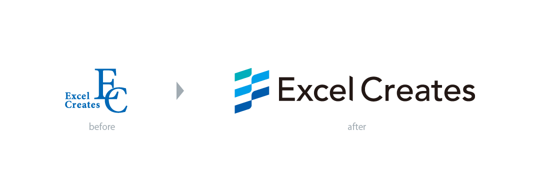
Excel-Creates Company logo was redesigned in-house

Why redesign the logo be decided, and what does the redesign logo mean?
Through a dialogue between CEO and designers, we will deliver the background of the logo redesign.
―― As you can see, could you tell us about your interpretation of the company name Excel-Creates? ――
CEO: In the first place, I wanted to build a better medical system that meets the needs of the medical industry. At that time, I thought of Excelent (excellent) + Creates (a new product), so I used Excel-Creates as a synthetic word as it is. We will continue to provide better products by accumulating medical know-how and linking it with new IT technologies.
―― The symbol mark is composed of many colors, what is the reason ? ――
CEO: Well, the company’s corporate color was also formulated as a result of the logo renewal design.
First of all, there are various thoughts that it is blue system three colors selection. In recent years, we have increased our product lineup according to the times and needs, including web version product development.
In addition, in recent years, we have been promoting overseas communication, and we are aiming for the development and growth of multi-unitization as a company business. As a result, we would like to further enhance and revitalize internal communication.

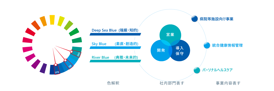
In-house designer: These three colors make sense to fable.
Inner branding is the representative color of each department in the organization:
Deep Sea Blue (DB) is a reassuring, traditional image that symbolizes the in-house deployment and maintenance team.
SkyBlue (SB) is a development team that means trust and creating new things.
RiverBlue (RB) is an image that proposes a leading-edge product suitable for customers.
In outer branding, we would like to reflect the business content and products depending on the client base:
It is designated as package software (DB color) for general hospitals and companies, integrated healthcare information management system for clinics (SB color), and personal healthcare service for individuals (RB color).
The color values of these three colors are specified with a uniform angle difference in the mansell hue ring, and are reflected in the company philosophy of “forward” and “execute” in an image with movement like a flag.
―― What is the concept of the logo form ――
In-house designer: My first thought is to reflect the company’s business.
During the programming process, the programming language code and source are projected on the monitor, and the keyboard is used as a motif to express the image of software system development.
In addition, I was thinking about form design that emphasizes inner branding and outer branding effect.
In order to be better at delivering products to customers, each department is combined to form a flag-like shape, and everyone in the company is moving toward the same goal and expressing a forward-looking, executing image.
Outside the company, the motif is a checkered flag that symbolizes prosperity and a checkered flag that symbolizes the final goal. It is also reflected in the company philosophy of “growing together with customers and sharing the “truth””.
Finally, it is a consideration of tradition, there is also a meaning to respect the company history and development history, and as a result of extracting the shape elements of the past LOGO and evolving it so that it is used for many years and does not feel uncomfortable with the form of LOGO, it has also became an abstract type of initials of “E” and “C”.

① Form element extraction
② Abstract deformation motif: “Checker” toward the final goal × “Ichimatsumon” symbolizing prosperity
③ Meaningful design: Business content symbol × company division symbol× corporate color arrangement× express the corporate culture of execution, execution, and improvement
―― After the logo redesign, what will you focus on about branding in the future ? ――
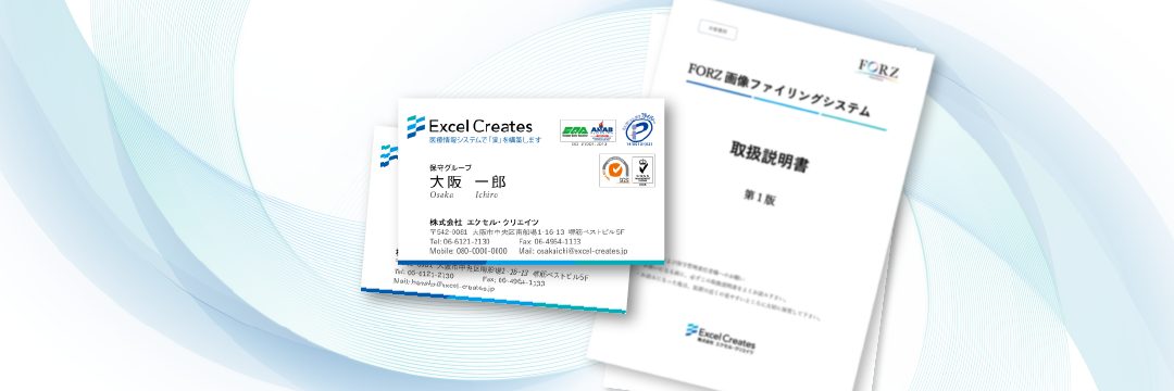
In-house designer: Expanding logo design is part of branding, and we want to unify our corporate and vision identities. Take a business card as an example: Extract the DNA of the symbol mark and use the accent form of the business card.

CEO: Well, in fact, branding of the main product is progressing, and while solidifying the company image, we are also developing branding of the FORZ series and Web services. We also plan to implement UI for all products, so we look forward to putting branding elements in the UI design until we have a more user-friendly interface for end users.
- Categories
- Company information

